Friday, October 17, 2014

2nd Grader's Interpretation of Kandinsky's Houses in Munich


Second graders painted houses inspired by Kandinsky's Houses in Munich. I love how they turned out and the students had a lot of fun being bold with their color choices and brushstrokes and mixing multiple colors to create more interesting variations.  We drew the houses first in pencil, traced it in black crayon, and painted them in with tempera. Once dry, they used a flat brush to add windows. After the windows were dry, they outlined everything with black tempera. It's important to note that when outlining in such a strong color like black, students really need to paint with the tip of their brush and hold it straight up so as to create a thinner line. Adding just a hint of water also helps make the line smooth, otherwise the black will overpower their beautiful colors. That, of course, is challenging for second graders! Maybe next time I'll have students trace with black oil pastel so at least the line quality will be more consistent.

Thursday, October 16, 2014

Bulletin Boards

My bulletin board for first grade's Autumn Birch Trees

Here are kindergartener's paper line sculptures that I borrowed from Cassie Stephen's awesome blog, their flowers decorated with lines and jellyfish. 

Thursday, October 9, 2014

Kindergarten: Oil Resist Jellyfish


All of the grades are learning about lines with different projects.  As one of the last lessons for this unit, jellyfish tentacles were an appropriate inspiration I thought. Students pretended their arms were tentacles and we wiggled our arms in slow syrupy motions before we started drawing. They had done two previous lessons on Line so they were getting pretty good at drawing wavy and loopy lines. The jellyfish was drawn with oil pastels and painted over with liquid watercolor. They mixed in a little black  so that the water would begin dark and gradually get lighter towards the top.

First grade: Turtles with Lines


First graders drew swirls, zigzags, and cross hatches on their colorful turtles. They painted their turtles with tempera and when dried, drew their lines in oil pastel. 

Tuesday, October 7, 2014

Kindergarten's Interpretation of Monet's Water Lily Pond


 These were done with my enrichment students after school. I love how they turned out and wish I had more to show, but it's a suuuuuuuper small class. I first showed them references of Monet and Renoir and we discussed their style of painting: how they dabbed their brushes to show all the different colors of light dancing on the surface, the many different greens and yellows Monet used instead of just one, and I also showed them a picture of the actual pond that inspired his painting. Then students taped a bridge in the middle of their paper with masking tape and painted below, above, and between the bridge with pre-mixed tempera. I told them to think of pond and lily colors for everything below the bridge and tree colors for everything between and above the bridge. Once it was dry, students peeled off the tape and colored it in with colored pencil.

Friday, October 3, 2014

Third-Fifth: Master Study of John Audubon's American White Pelican


As a lesson on line and shape, I showed my students paintings by John Audubon and had them compare it with Charlie Harper's graphic illustrations. I love Harper's minimalist approach to his animals, and I find them just as realistic as Audubon's, just expressed in a different way. I don't do master studies too often because I don't want students to feel restricted, but they're surprisingly enjoying learning new skills and Audubon's techniques in giving dimensionality to his subjects, like how shading makes the bird look three dimensional, how Audubon painted the background dark to create contrast with the white pelican, etc. 


Tour of my art room!

I've been loving seeing all the class tours by my favorite art teacher bloggers and I wanted to join the bandwagon. My room is nowhere near as cool and organized, but as a former art-on-the-cart teacher I am super grateful for my space. Here's some photos if you're interested!

My white board. That art history timeline below the board is awesome and right at the students' eye level when they sit in front. There is a lot of nude art on it obviously and it sparked a good conversation on naked vs nude and how to respond like mature artists! :)

I have an "Art Class Jobs" chart with students' names on clothespins. They are organized in bins by class. 

 I got these containers from The Container Store to store my students' artwork. It does the job, but I may need to put in a divider to organize each project. 

Here are two supply shelves graced with a Frank Stella sculpture that my older elementary students made last year. 

My bookshelf. Students can check out books for free draw if they wish. 

And now my art storage room. I could have removed that wall so my class is bigger, but I do love having all this mess hidden. Hmm..still debating..

Mason jars that I got from the 99cent store for a dollar each. I like them because they're easy to wash and easy to hold with the handles. 

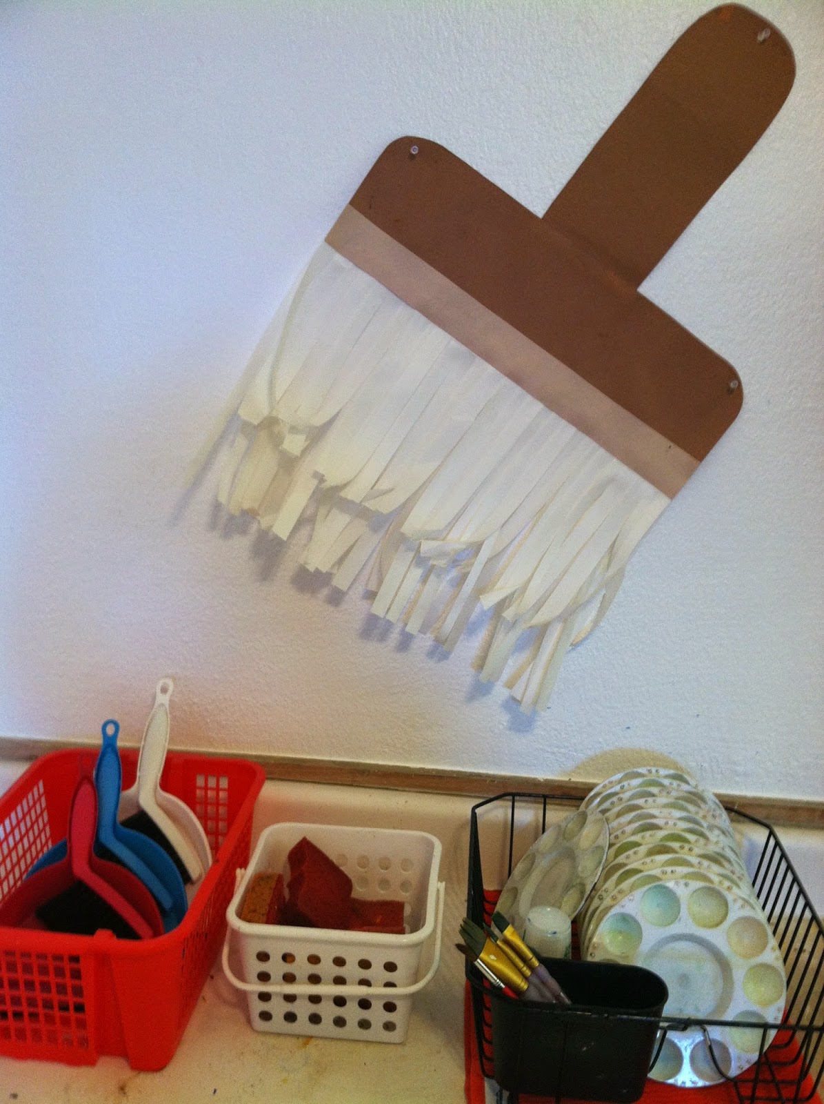
A dish rack that I use for palettes, sponges for wiping down tables and dust pans for everything else.

Making my example for a future Kandinsky lesson with leftover paint. 

View when you walk inside. Hope you enjoyed my tour!