Tuesday, October 7, 2014

Kindergarten's Interpretation of Monet's Water Lily Pond


 These were done with my enrichment students after school. I love how they turned out and wish I had more to show, but it's a suuuuuuuper small class. I first showed them references of Monet and Renoir and we discussed their style of painting: how they dabbed their brushes to show all the different colors of light dancing on the surface, the many different greens and yellows Monet used instead of just one, and I also showed them a picture of the actual pond that inspired his painting. Then students taped a bridge in the middle of their paper with masking tape and painted below, above, and between the bridge with pre-mixed tempera. I told them to think of pond and lily colors for everything below the bridge and tree colors for everything between and above the bridge. Once it was dry, students peeled off the tape and colored it in with colored pencil.

Friday, October 3, 2014

Third-Fifth: Master Study of John Audubon's American White Pelican


As a lesson on line and shape, I showed my students paintings by John Audubon and had them compare it with Charlie Harper's graphic illustrations. I love Harper's minimalist approach to his animals, and I find them just as realistic as Audubon's, just expressed in a different way. I don't do master studies too often because I don't want students to feel restricted, but they're surprisingly enjoying learning new skills and Audubon's techniques in giving dimensionality to his subjects, like how shading makes the bird look three dimensional, how Audubon painted the background dark to create contrast with the white pelican, etc. 


Tour of my art room!

I've been loving seeing all the class tours by my favorite art teacher bloggers and I wanted to join the bandwagon. My room is nowhere near as cool and organized, but as a former art-on-the-cart teacher I am super grateful for my space. Here's some photos if you're interested!

My white board. That art history timeline below the board is awesome and right at the students' eye level when they sit in front. There is a lot of nude art on it obviously and it sparked a good conversation on naked vs nude and how to respond like mature artists! :)

I have an "Art Class Jobs" chart with students' names on clothespins. They are organized in bins by class. 

 I got these containers from The Container Store to store my students' artwork. It does the job, but I may need to put in a divider to organize each project. 

Here are two supply shelves graced with a Frank Stella sculpture that my older elementary students made last year. 

My bookshelf. Students can check out books for free draw if they wish. 

And now my art storage room. I could have removed that wall so my class is bigger, but I do love having all this mess hidden. Hmm..still debating..

Mason jars that I got from the 99cent store for a dollar each. I like them because they're easy to wash and easy to hold with the handles. 

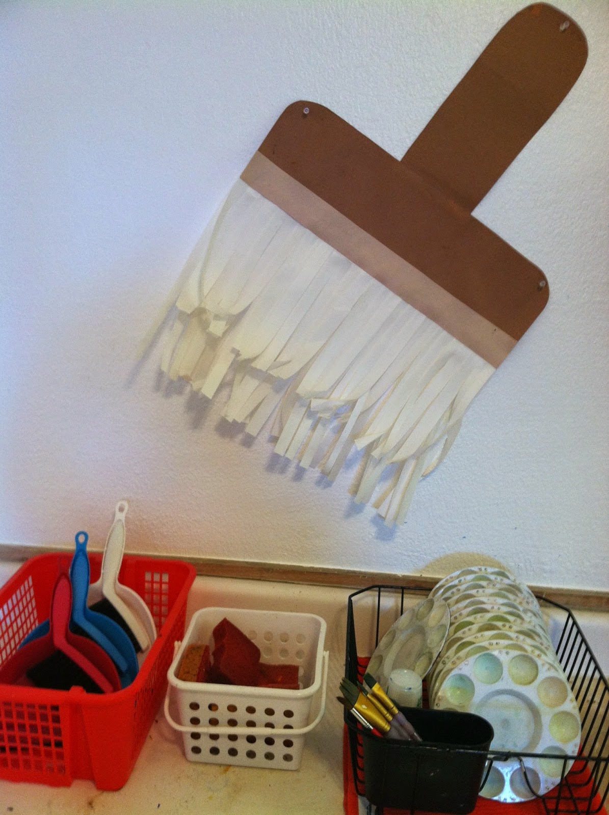
A dish rack that I use for palettes, sponges for wiping down tables and dust pans for everything else.

Making my example for a future Kandinsky lesson with leftover paint. 

View when you walk inside. Hope you enjoyed my tour!

Friday, September 26, 2014

Kindergarten: Monsters and Lines


I came across this book while shopping for other books on Amazon and I knew it would be perfect for teaching my kinders about different kinds of lines. Plus, who can resist adorable monsters?

While we read the book, I had students draw a wiggly line, a curly line, a wavy line, a zigzag line, and a whole buncha others with their fingers in the air to prepare them for drawing them on paper. After the book, they sketched a large "skinny rainbow" or "upside down U" on a color paper of their choice. Then I guided them in drawing the nose, which was a combo of straight and curly lines, eyes, and arms. Once the monster was drawn, they practiced their lines on a sheet of paper.

For the second class, students drew their lines on the monster with Elmer's glue and then sprinkled, er dumped, glitter all over their monster. It was super fun tilting the paper down and seeing their monster bejeweled in sparkly lines. They also remind me of Cosby sweaters, but I didn't say that because they would have noooo idea what I was talking about.

Wednesday, September 17, 2014

First grade- Birch Trees in Autumn


I came across Simon Fairless' Silver Birch in Autumn painting and had to make a lesson out of it. It's so stinkin' beautiful! and perfect for Fall even though it doesn't actually start feeling crisp until January here in SoCal. This lesson was great for elements of art terms such as: repetition, lines, and space. We discussed how Fairless made some of the trees appear to be farther back by painting them darker and how the dark background contrasts nicely with the white trees.  After our discussion, students drew pairs of vertical lines across their page with short marks to distinguish the birch from the background. Then they mixed a dark gray and painted between the trees.  For the second class, students painted a few of the trees a light gray to push it back into the space. Once they were dried, they painted black dash marks on the bark. The leaves were created by dabbing a corner of a sponge in warm Fall colors. I love how they turned out.

Although I'm happy with them, it could have taken less time. This lesson took four classes, but I think it could have easily taken three at the most if I had given students colored sulphite paper. However, the background wouldn't have been as interesting.

Tuesday, September 16, 2014

Kindergarten- Fall Trees


Kindergarteners are starting off the year learning about color.  After reading them a fun book called Color Dance, students learned about primary colors and warm and cool colors (secondary colors will come later, starting off simple for now!). For the first part of the lesson, students painted circular clouds  of warm Fall colored leaves for their tree. Once that was dry, I dropped a tiny blob of ink at the bottom of their paper and they blew the ink through a straw for the trunk and spread it out into branches. It helps to tilt the paper down so the ink can flow better, and we don't want purple faced kinders! For the second class, students used cool colors to paint the sky. 
This is a favorite lesson of mine because students have so much fun mixing colors, especially seeing the water turn into a delicious "pink lemonade" or purple "Gatorade". It's a magical process. Plus, they get to blow ink through a straw and that is always a hit. 

Friday, September 12, 2014

2nd Grade: Positive and Negative Leaf Prints


Positive and Negative prints

I borrowed this fantastic idea from the fantastic Cassie Stephens! It's a great lesson- completely student lead and very successful and so satisfying; lifting up that sheet with the printed image never gets old! The night before the lesson I made gelatin (for the first time! Yay!) and by morning it was nice and firm and ready to go.

In the above photo, a student first inked the gelatin with black water soluble printing ink and then arranged her plants on top. 


When she was done, she placed a sheet of paper on top and rubbed it with her hands. We used drawing paper. 


Here she's gently pulling the paper off the gelatin. The gelatin is rubbery so the paper picks up the ink really well leaving a perfect silhouette of the plants. 


Making the negative print was already cool, but Cassie Stephens  had the awesome idea to make a positive image of the leaves as well! As you can see, when the students lifted off the leaves, there was a delightfully beautiful and detailed print of it. 

So purty!!

Other lovely examples.


Students also printed with flowers by pressing them face down on the ink and stamping them onto their paper.